Back to Basics: Rules of Effective Typography
Nicole Dean
Nicole Dean
Back to Basics
Typography is one of the most cherished parts about graphic design. No matter how seasoned of a designer you are, it’s always good to refresh your memory about the basics of typography. Things such as the anatomy of typography and the different classifications aren’t necessarily something that you absolutely need to know but it sure sounds impressive when you prove to a client that you do know them! Words like ascender, descender, x-height, leading, kerning, tracking, serif, and sanserif should definitely be in your typography vocabulary. Why? Because you’re a designer! Without realizing it, you are very much aware of these words every single day. Knowing when to use these words will really set you apart from your fellow designers. As for all designs, the best part about learning all of the typography rules, once you know them, you can break them!
Quick Definitions
Leading – Adjusting the space between lines of text
*The thing to focus on when adjusting your leading is to make sure it’s still legible. You want to be able to easily read your paragraph or lines of text and not have to jump halfway down the page just to finish a sentence.
Kerning – Adjusting the spacing between two individual letters in a word
Tracking – Adjusting the space between all of the letters in a word simultaneously
*The thing to focus on when adjusting tracking and kerning and to not focus on the letters themselves but the spaces between the letters. A trick to perfect your spacing is to flip the word upside down and then do your adjusting. Giving you a different perspective on it helps you see spacing that you wouldn’t have seen the regular way.
What are the different classifications of typography?
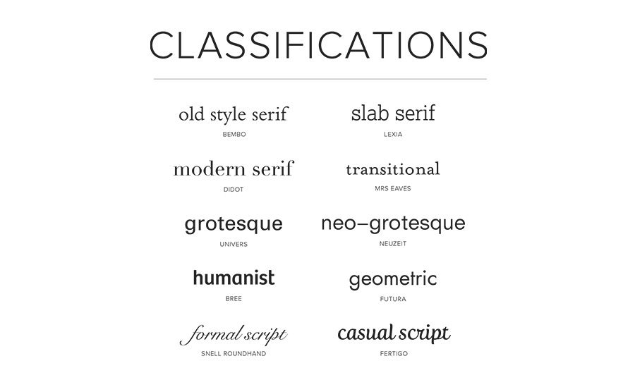
Serif Type Styles
- Old Style
- Transitional
- Neoclassical & Didone
- Slab
- Clarendon
- Glyphic
Sans Serif Type Styles
- Grotesque
- Square
- Humanistic
- Geometric
Script Type Styles
- Formal
- Casual
- Calligraphic
- Blackletter & Lombardic
Decorative
- Grunge
- Psychedelic
- Graffiti
What is the difference between font and a typeface?
Oftentimes designers get asked what the difference is between a font and a typeface. Even seasoned Graphic Designers can get this wrong. Many people, designers and non-designers just think a font and a typeface are the same thing. That’s actually not the case. Back before computers, and even still today, type was placed on prints using individual metal letters with ink pressed down on paper. That’s where the terms typeface and font started. A typeface is all of the individual metal blocks a printer had on hand. A font is a subset of the blocks in the typeface. For example, Garamond in 12 point is considered a different font than Garamond in 8 point. All of the metal blocks within Garamond, however, are considered a typeface. Another example is Times New Roman in 24 point is considered a different font than italicized Times New Roman at 28 point. Just like all of the metal blocks within Times New Roman are considered a typeface.
Some basic rules to follow for creating effective typography:
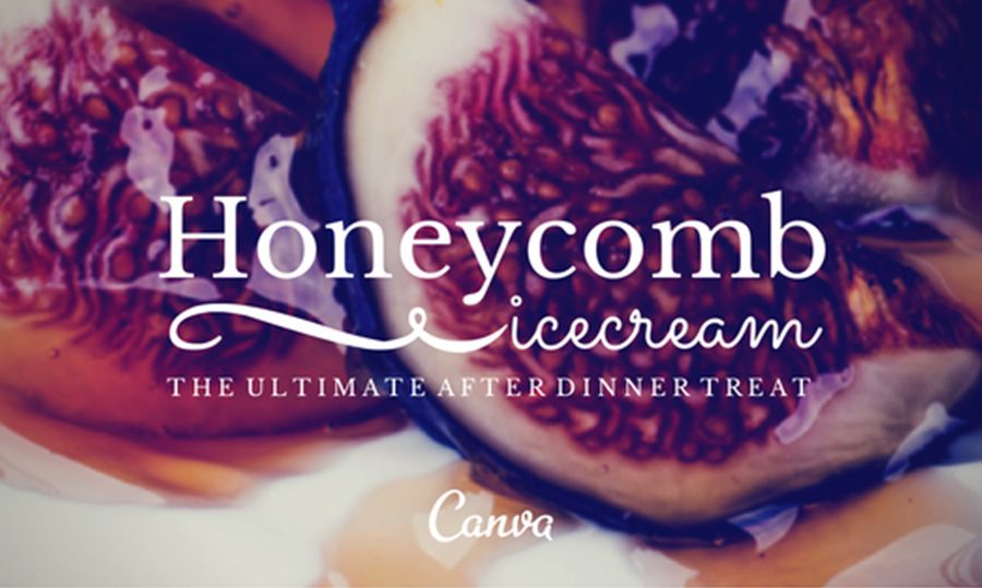
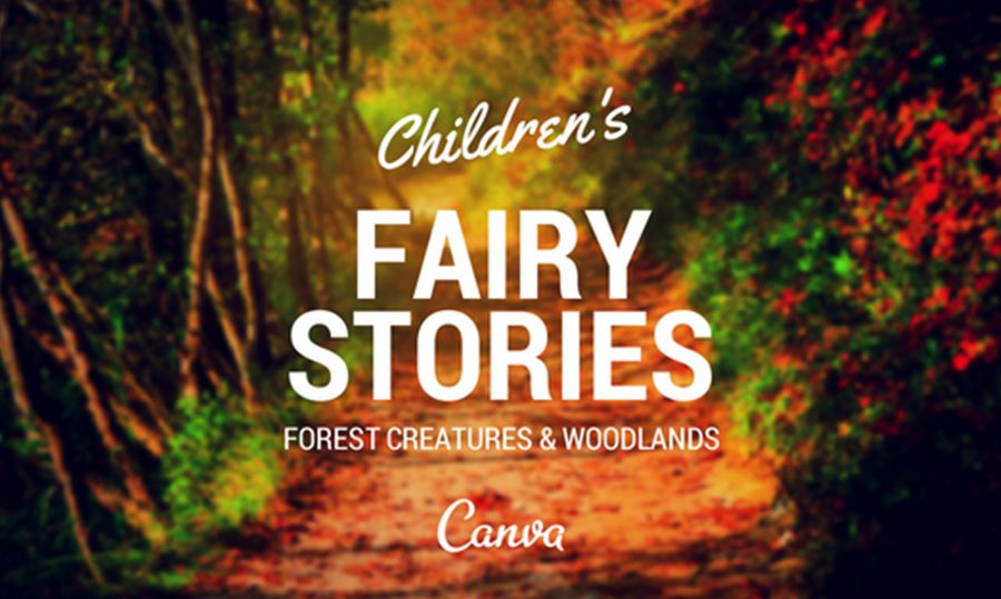
- Beware of Font Communication
When designing, you want to make sure that your type is communicating to your audience. Not only just by making sure that your copy is well written and spelled correctly, but there are so many fonts to choose from these days, you want to make sure the font you choose for your design fits your audience. For example, you wouldn’t make a brochure for an Accounting company filled with rainbow cartoon lettering that would be better served for a kindergarten booklet, would you?
- Alignment makes or breaks your design
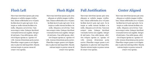 Alignment is very important to pay attention to when designing. A lot of non-designers have a tendency to either center align everything or justify text leaving paragraphs looking poorly designed and hard to read. There are four major alignment options. Left Aligned (Flush Left), Center Aligned, Right Aligned (Flush Right), or Justified. Left alignment is most common in almost everything because we read left to right and it’s easy on the eyes for everything to start perfectly aligned on the left side of a page. Aligning right for the same purpose of having it look nice with everything aligned on one side can look nice but it needs to be done correctly. With both Left aligning and right aligning, you need to watch for ragged lines. Ragged lines are when there is a lot of difference between the lengths of the lines of text. As you can see below, Example A has ragged lines and Example B as a smoother transition between the lengths. The lengths of the lines still differ but it’s not as “bumpy”.
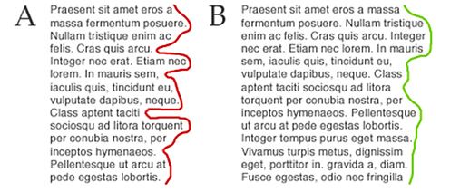
Ragged lines are also very noticeable when center aligning text if it’s not done correctly. When you have a lot of “bumps” in your paragraphs, you might want to adjust the length of your lines by making a few soft returns on some lines.Justified type is often a designer’s worst nightmare. Justified type looks clean and beautiful when done right. But when done wrong, you can certainly tell and it adds a lot of strain on the eye if not perfected. With justified type you want to avoid rivers in your paragraphs. Designers like to say, “If you can drive a boat between your text, you need to adjust it!” There are a couple of ways to fix the “rivers” (big lines in between the words where you can easily draw a line through text). You can adjust the tracking but make sure that the text is still readable and there isn’t too much space between the letters, you can also add soft returns on some lines that have more words on it to even out lines and adjust the spacing.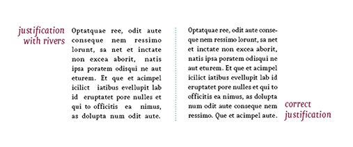 One major pet peeve that designers have with typography is hyphenated words. When you’re reading a paragraph and you have to start a word on one line and jump down to the next like just to finish the word, it gets very frustrating. Especially when it happens on every other line in the paragraph. There are ways in InDesign to make sure that Hyphenation is not checked off. Please uncheck this if it’s checked! Hyphenated words do not help your design at all.


 One major pet peeve that designers have with typography is hyphenated words. When you’re reading a paragraph and you have to start a word on one line and jump down to the next like just to finish the word, it gets very frustrating. Especially when it happens on every other line in the paragraph. There are ways in InDesign to make sure that Hyphenation is not checked off. Please uncheck this if it’s checked! Hyphenated words do not help your design at all.
- Choose a good secondary font when font pairing
Font pairing is essential to the legibility of your design. When you have a heading with a subhead, having two different fonts that compliment each other is a great way to differentiate the hierarchy. The difficulty with font pairing is that you don’t want to have two conflicting fonts or two fonts that are so similar, you can barely see a difference between the two. You want to make it as delightful on the viewer’s eye as possible. Just My Type is a great website to go to for reference with font paring.