10 Responsive Web Design Frameworks You Should Know
Isaiah Bollinger
Isaiah Bollinger
Responsive design is taking over the web design industry because it allows a website to be user friendly for all device sizes without developing a separate mobile website for different devises or screen sizes. If you are looking to build a new website for your company, a responsive site should be high on your list of items you need due to the mobile future of the web. Responsive frameworks can drastically speed up the responsive web design process as well as many other front end development features that you may want on your website such as modals, off canvas menus, and more.
Here are ten great responsive frameworks that can facilitate and speed up the responsive design process:
1) Foundation
Developed by Zurb, Foundation is the most feature rich responsive framework availabe. It has Sass available with the install as well as a diverse library of features such as modal, Off Canvas, Improved Canvas, GPU acceleration, fastclick.js, and many other awesome features for front end developers. Investing in a website built with Foundation as your front end framework is a great long term strategy for the future of your website.
Having worked extensively with many responsive frameworks, Trellis has fully committed to using Foundation for all of our new website builds because of the flexibility and nearly limitless front-end capabilities it provides us as a company. It is truly an enterprise level responsive framework that can take any site to the next level.

2) Bootstrap
It is pretty clear at this point that Bootstrap is the most popular responsive framework that is used on millions of websites. Many themes on Themeforest are built with the bootstrap framework. Your website might even be built with a theme that was built on top of Bootstrap and you didn’t even know it. Bootstrap has a slightly lower learning curve than Foundation and is great for a beginner learning responsive web design. I consider it the WordPress of responsive design as opposed to the more Enterprise features of Foundation.

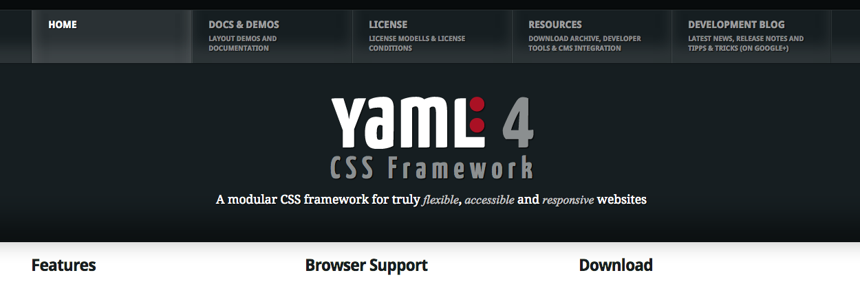
3) YAML
Yaml is a modular CSS framework for truly flexible, accessible and responsive websites. YAML is tested and supported in major modern browsers like Chrome, Firefox, Opera, Safari and Internet Explorer.
4) Skeleton
The Skeleton framework is a simple, easy to use, CSS responsive framework that comes completely style agnostic. It is a great quick way to get started with a responsive website without the added features that you might not want with something like the Bootstrap or Foundation framework. You will notice the site has literally no colors because it is meant to be completely basic so that you can customize it quickly to the brand and colors / styles that you want your site to have.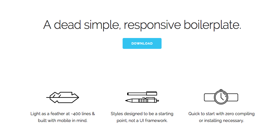
5) Pure
The Pure framework is a set of small responsive css modules that you can use in every web project. This is a great tool because you can use these modules for any project even if you are using other frameworks or just want one of the modules, not the entire Pure framework. Definitely worth taking a look at if you are building responsive websites.

6) The Responsive Grid System
The Responsive Grid System is an interesting approach to responsive design in that it claims to plug into your existing HTLM and CSS. It is a very simple responsive grid system that can be added to an existing site that is not yet responsive. This is a great option if you simply want a very straightforward responsive grid system without any other functionality.

7) Amazium
Another lesser known responsive framework is Amazium, which is a simple responsive grid that has much less code than some of the larger responsive frameworks. It is another great beginner responsive grid worth checking out especially if you do not need all the extra front end modules that come with something like Bootstrap or Foundation.

8) Less Framework 4
The Less Framework is another CSS grid system for designing responsive websites. It comes with 4 layouts and 3 sets of typography you can use based on a single grid system. The advantage of the Less Framework is that you can use it to create multiple layout types easily and reuse parts of one layout for another layout with changing a lot of code.

9) Responsive
The Responsive framework is one of the most lightweight HTML, Sass, CSS, JavaScript frameworks out there. The combined CSS and Javascript files when minified and gzipped are only 25.5kb which is very small compared to many other responsive frameworks.

10) BareKit
The Barekit framework is another minimalist responsive framework that comes with zero styling that you might find in other frameworks. Barekit is a new responsive framework that has just been released by AppendTo so its worth checking it out.
Leave a Comment