Moore & Giles
BigCommerce
- Design
- Development
- Integrations
- Strategy


Results
Migration to BigCommerce
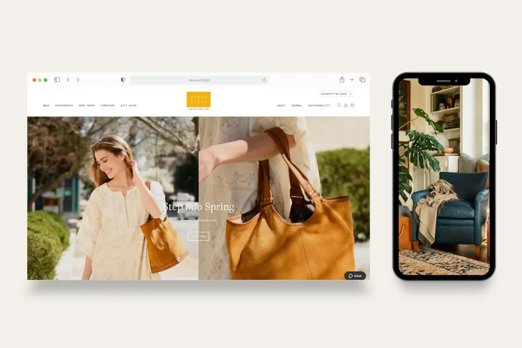
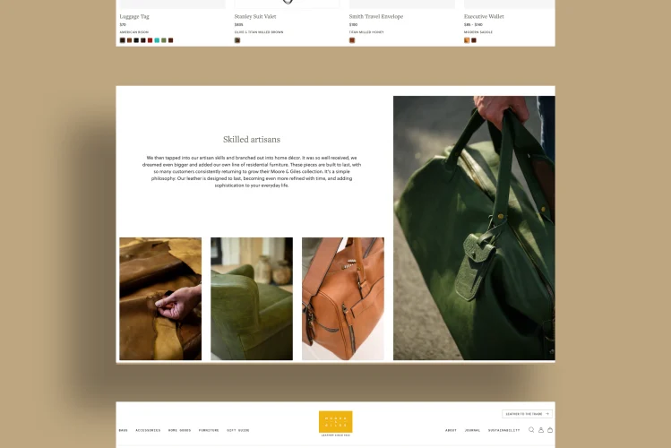
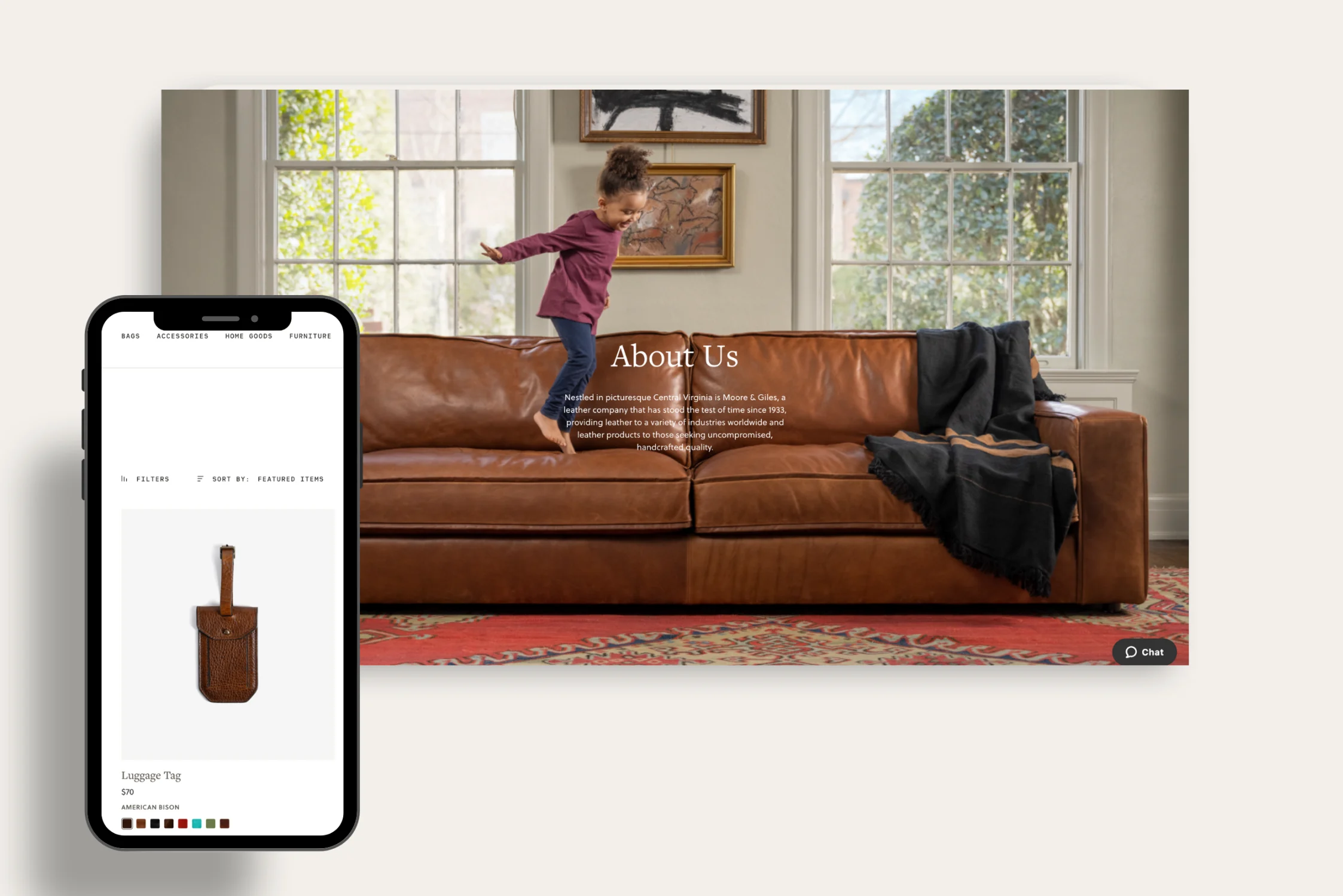
Trellis successfully re-platformed the Moore & Giles eCommerce website from WooCommerce onto BigCommerce to improve performance, stability, security, scalability, and overall user experience while maintaining all of the necessary integrations and data that existed on their previous site. Trellis meticulously planned and executed the integration of BigCommerce’s robust platform, focusing on a custom theme that would not only resonate with the Moore & Giles brand identity but also facilitate a seamless user journey.
Custom Theme Features
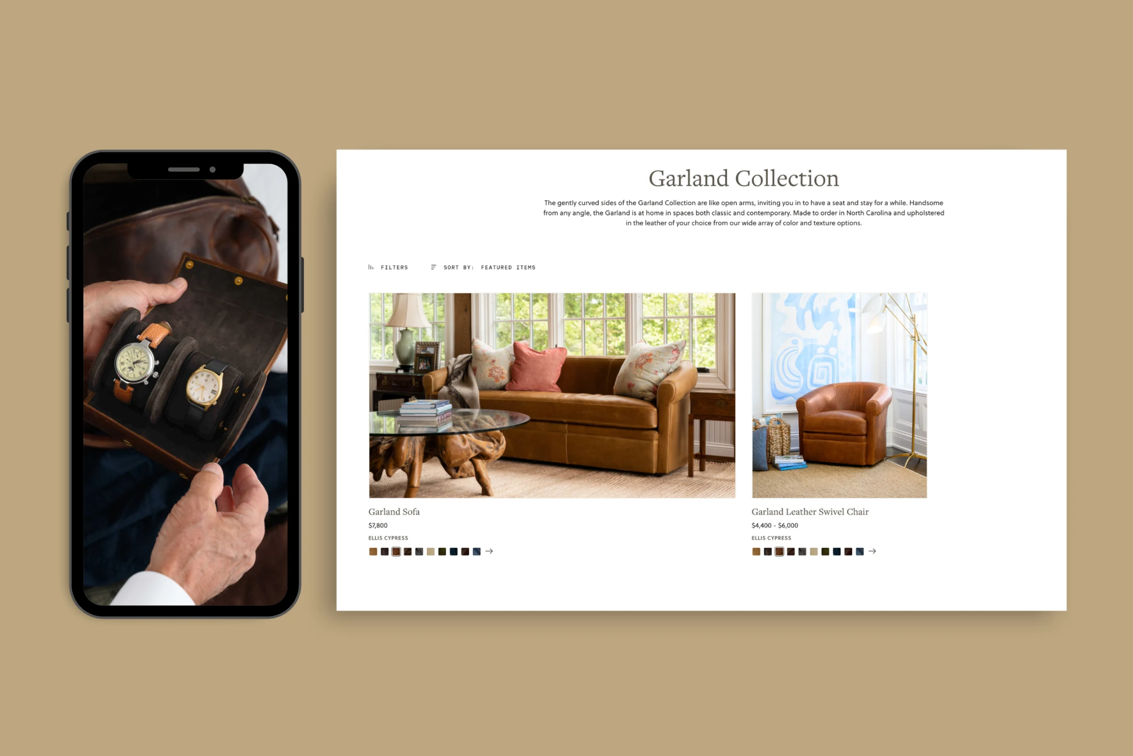
To optimize the user experience for Moore & Giles’ premium “made to order” furniture and finished goods, Trellis implemented several custom theme features aimed at enhancing the presentation and accessibility of product variant information. Recognizing the importance of variant-level data, Trellis utilized variant metafields to introduce functionalities such as automatic switching between “Made to Order” and “Ready to Ship” variants based on inventory, customizable default variant displays in product listings, and features like monogramming, preordering, and waitlisting. Additionally, enhancements like a dynamic product image gallery, related product suggestions, badge displays, back-in-stock notifications, a Cylindo 360 viewer, and interactive swatches on listing cards were developed. Designed features aim to clarify variant distinctions and improve customer decision-making.
Seamless Content Creation
Trellis enhanced the admin panel experience for the Moore & Giles marketing team by integrating the BigCommerce Page Builder with 25 custom widgets, transforming content creation into a seamless and intuitive process with a fully adaptable mega menu. New widgets were designed to be flexible, reusable, and effortlessly customizable, enabling the marketing team to tailor virtually every detail of the site’s appearance without needing to delve into coding or seek developer support.
More Integrations
Trellis leveraged BigCommerce’s robust network of third-party apps to enhance the customer experience further, utilizing Shipper HQ (for shipping rates and rules), Affirm (for payment installments), Listrak (for email marketing and stock alerts), Avalara (for taxes), Zonos (for international checkout), Narvar (for optimizing the post-purchase experience), Google (for tag management, analytics, marketing, and retargeted advertising), and Facebook (for marketing and retargeted advertising).
We also collaborated with the Moore & Giles team to support an integration with NetSuite using a combination of the NetSuite Connector by Oracle NetSuite and an integration with a custom in-house PIM system.
Looking Ahead
The collaboration between Moore & Giles and Trellis has set a new standard for luxury retail in the digital space. The newly launched website not only meets the sophisticated demands of Moore & Giles’ clientele but also positions the brand for sustained growth and success in the competitive retail landscape. With the successful implementation of this project, Moore & Giles has seen a significant enhancement in their eCommerce capabilities, from improved site performance to an enriched customer experience. Looking ahead, Moore & Giles and Trellis are poised to further innovate their online presence, with plans to extend the new platform to their B2B storefront, promising an even broader reach and impact.


More Case Studies