case study for EndurElite by Nutrabio

EndurElite by Nutrabio

Shopify

  • Design
  • Development
  • Integrations
  • Strategy
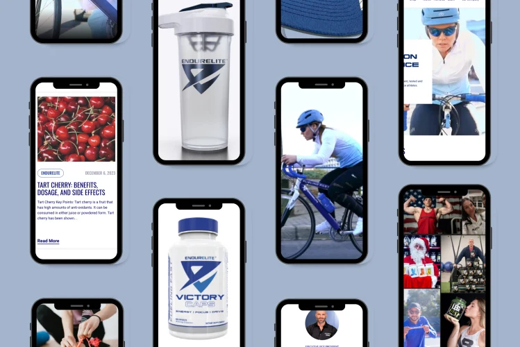
A collage featuring various EndurElite branded products and promotional content. There are multiple smartphone screenshots displaying articles about tart cherries and athletes, a clear water bottle with the EndurElite logo, a container of Victory Caps supplements, and people engaging in different activities. In one screenshot, a cyclist in motion is wearing a blue helmet and cycling attire. Other images include people lifting weights, someone dressed as Santa Claus, and individuals holding the brand's products, all suggesting a focus on fitness and health.
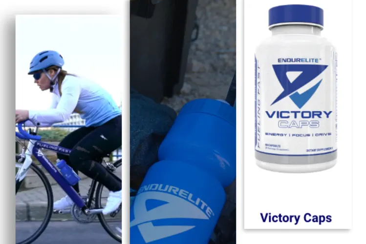
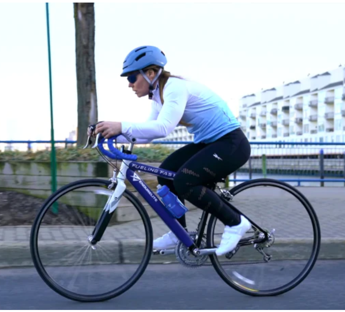
A composite image featuring EndurElite branded products and a cyclist. On the left, a cyclist in a blue helmet and white long-sleeved jersey is focused while riding a blue and white road bike. In the middle, two blue EndurElite branded shaker bottles are shown, with one bottle in front of the other, hinting at the brand's focus on sports nutrition. On the right, a bottle of 'Victory Caps' dietary supplements is displayed prominently with the name and logo visible, suggesting a product designed for athletic performance enhancement.
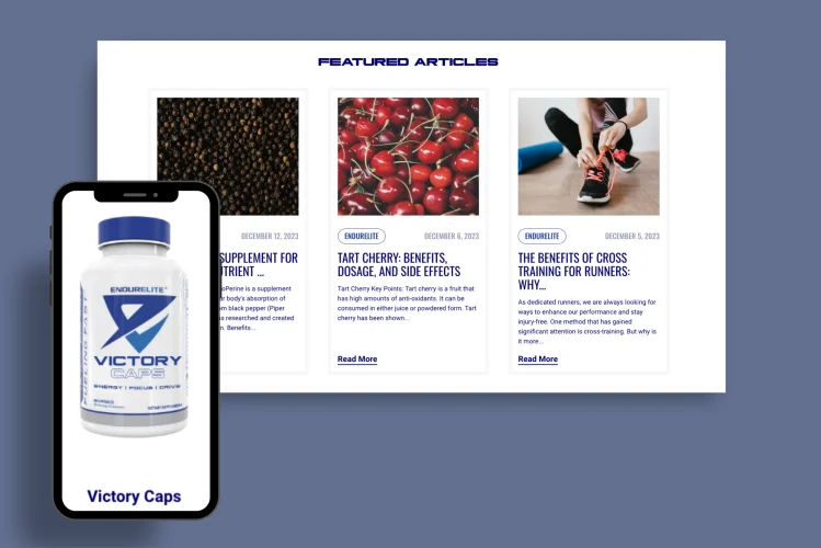
An image showing a smartphone and three featured article thumbnails from a website. On the smartphone screen, there is a bottle of 'Victory Caps' supplements with the EndurElite logo. The articles displayed are about health and fitness: the first discusses a supplement for nutrient absorption, with an image of black peppercorns; the second highlights the benefits, dosage, and side effects of tart cherries, with a vibrant photo of the fruit; and the third covers the benefits of cross-training for runners, depicted with an image of a person tying their running shoes. The layout is informative, aimed at providing readers with health and fitness insights.
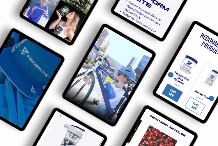
A digital montage showing various EndurElite branded products and content on different devices. There's a tablet displaying a blue EndurElite cap, a smartphone showing a woman drinking from a branded bottle, and another smartphone capturing a cyclist in motion. A text excerpt on a tablet screen promotes a performance formula, while another tablet screen features product recommendations, including two supplement bottles with 'Shop Now' buttons. The montage suggests an active, sports-focused lifestyle associated with the EndurElite brand.

Results

Trellis developed custom features, including a “Theme Switcher” and pre-defined “theme” options within widgets, to maintain brand consistency and offer a seamless shopping experience across the NutraBio and EndurElite brands. This inventive approach allowed for a cohesive presence on a single Shopify instance, overcoming Shopify’s limitations regarding multi-brand management. The “Theme Switcher” especially stood out as a pioneering solution, ensuring that navigating between shared pages did not disrupt the thematic experience, a common issue when hosting multiple brands on one platform.

Utilizing third-party apps like Matrixify for data migration and Klevu for brand-specific search results, Trellis tailored the Shopify site to meet NutraBio’s complex needs. These integrations facilitated the smooth transition of EndurElite onto the nutrabio.com website, ensuring that product searches and customer interactions remained brand-appropriate. This level of customization was critical in creating distinct but integrated brand experiences within a unified store architecture.
View Project
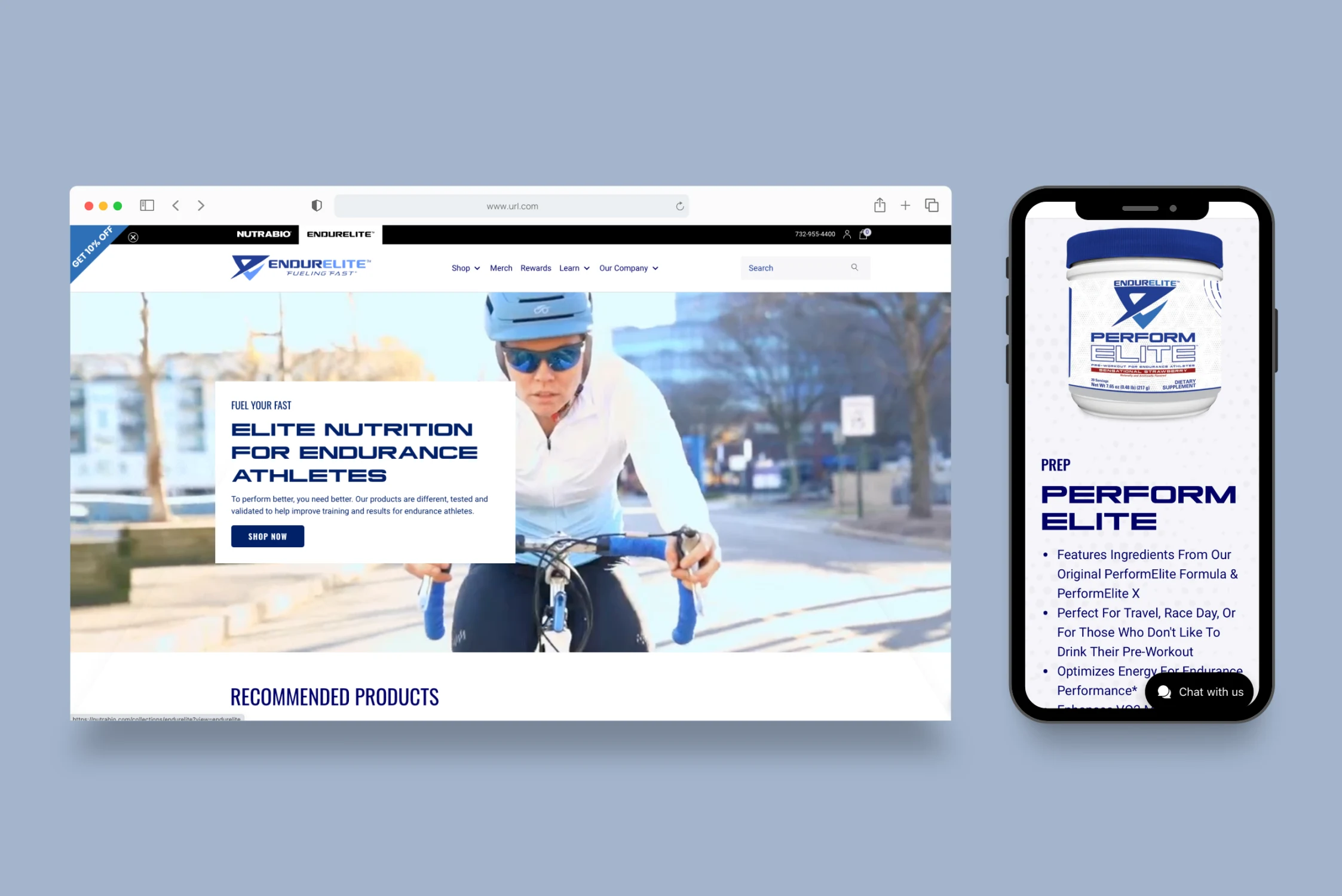
The image is a split screen showing two digital displays. On the left, there's a webpage on a desktop browser with the EndurElite logo at the top. It features a headline 'ELITE NUTRITION FOR ENDURANCE ATHLETES' above a promotional photo of a cyclist in a blue helmet, emphasizing the company's focus on sports nutrition. A call-to-action button invites users to 'SHOP NOW' for endurance training products. On the right, a smartphone displays a product advertisement for 'PERFORM ELITE,' a dietary supplement with detailed bullet points about its benefits and usage, promoting enhanced endurance performance.
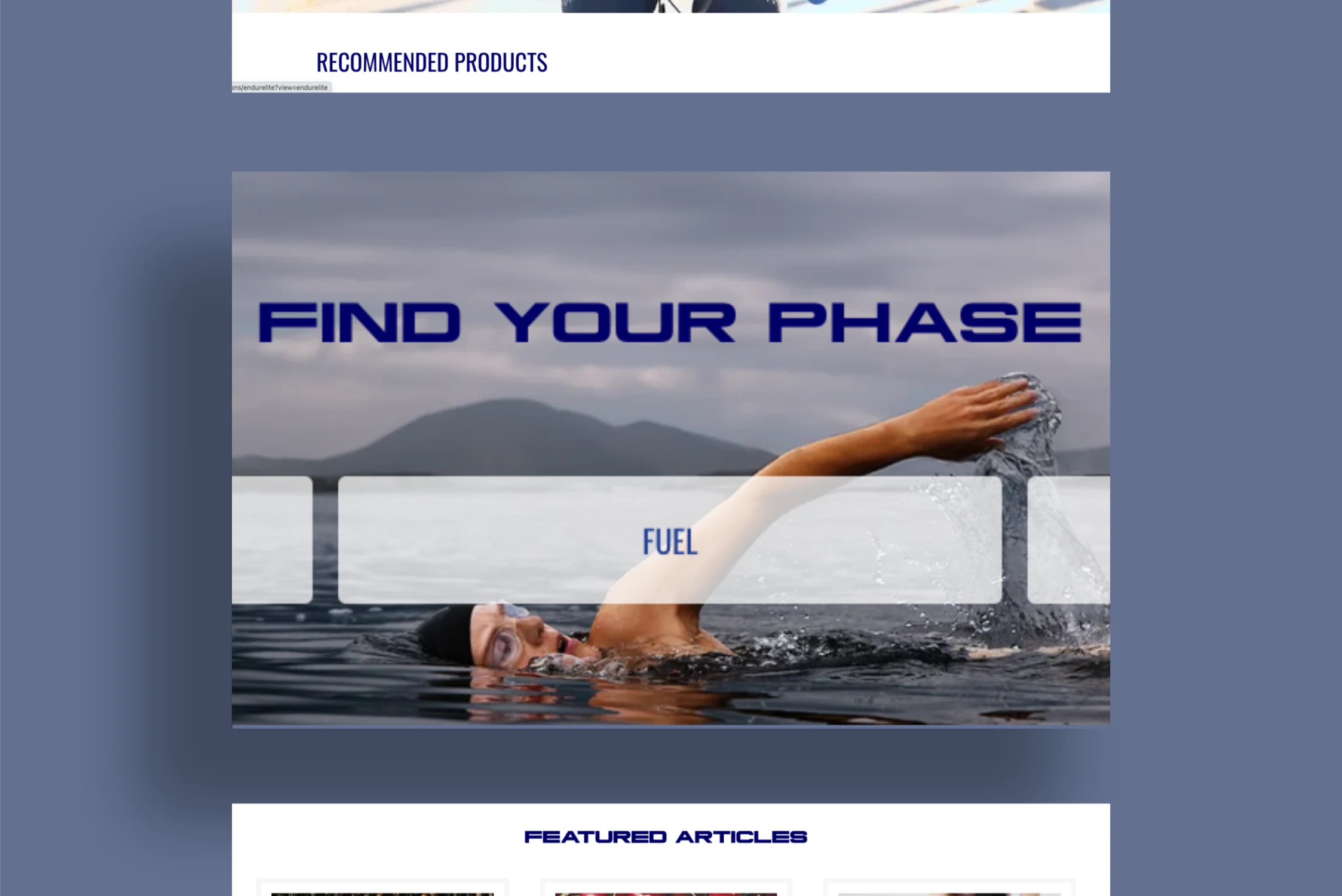
A webpage section with a banner reading 'FIND YOUR PHASE' set against a tranquil lake with a swimmer in mid-stroke. The swimmer's arm is extended out of the water, creating ripples and splashes, showcasing a strong swimming technique. Below the swimmer is the word 'FUEL' in bold, indicating a focus on nutrition or energy for athletic performance. The top part of the image has a header titled 'RECOMMENDED PRODUCTS' with a blurred background, and the bottom part of the image indicates a section for 'FEATURED ARTICLES,' suggesting a resource-rich website for athletes.

More Case Studies

See all projects

WORK WITH US

Let's team up and build something great together.

Get Started