The Trellis Guide to the E-Commerce Customer Lifecycle – Conversions
Jack D'Errico
Jack D'Errico
Every merchant selling online faces the never-ending challenge of increasing conversions on your e-commerce store. When it comes to sales, more is always better, as long as you can handle the fulfillment. Maximizing conversions is about convincing your shoppers to buy more (increase average order) and more often (Increase order volume). Learning how to do so effectively is somewhere between an art and a science. Luckily for you, it is easier than you think since there are a plethora of tools out there to keep your customers intrigued, maintain their brand loyalty, and persuade them to buy more and more over time.
Welcome to the third article in our series on the E-Commerce Customer Lifecycle (ECL)! This series will document unique factors in online selling that Trellis has learned over the past decade. In this series, we’ll focus on strategies and tactics that any brand can make use of to more effectively appeal to their customers.
Check out our first article, where we summarized each of the five steps for online store success. Our second article took a deep dive into the first step in the ECL guide, Acquisition, and covered how to attract customers to your online presence.
In this guide, we’ll explain each step a merchant can take to most effectively increase their conversion rate, including improvements you can make in design, aesthetics, and content, as well as how to promote your store and create a great user experience.
Stay tuned for our next article, where we’ll explain how to master Fulfillment, including inventory, shipping, packaging, and more!
Platform Selection & Infrastructure
Without a platform and infrastructure there is no way to have users convert on your website. The first thing to do is figure out how you are going to build your eCommerce website. This requires three things:
- A Domain Name
- Hosting
- A Platform
The domain name is simple and can be purchased via a solution like Godaddy. Hosting is also fairly straight forward to purchase but heavily depends on your platform. SaaS platforms like Shopify and BigCommerce take care of hosting for you, whereas platforms like Magento and WooCommerce require hosting on their own.
Matching your requirements to the platform is key to ensure the platform can handle your needs. Often times third party apps and plugins to the core platform can accomplish what you need.
Our analysis on the eCommerce platform landscape may help you choose the right platform for your needs.
Navigation: A Clear And Scenic Path To Purchase
What kind of experience have you built for a visitor that is new to your website? What information are they first presented? Does that first experience push the customer in a direction that is beneficial to your business? If your website is struggling with conversion despite having a sufficient audience of visitors, the site’s navigation may be faulty and exponentially worsening your bounce rate.
For this step, there are three main categories that a person viewing your site may fall into:
- “Window Shoppers” – These shoppers are curious about your store in a general way. They aren’t convinced of what they want to buy, or if they want anything at all.
- “Hunters” – This shopper has a specific item in mind and may be trying to find the solution to a problem they’re having. They may have been looking for a long time, or you may be their first stop as they evaluate their options. They may be comparing pricing or other product metrics from site to site.
- “Fans” – Their friend, coworker, family member, or even a stranger may have told them about your website. They could have read a review, seen a product placement, or watched a video. No matter the origin, they’re interested in a product from your brand specifically. These “referrals” have some background on the brand or product at hand.
To figure out what category your viewer fits into, it is a good idea to install a personalization engine that uses cookies to remember the behavior of each person. We really love Nextopia for this. Their solution makes your search, navigation, and merchandising work together so that every time your customer returns to your e-commerce store, they have a better experience than the last time. With each behavior, your site learns what they like to see. This means that they end up finding the products they’re most likely to buy faster with each successive visit!
Aesthetics: Mastering First Impressions
If your e-commerce site is easily-navigable and your personalization is on point, but there’s still more to be desired, it may be that your aesthetics are inconsistent with the rest of your brand.
To resolve this problem, start off by simplifying your color schema.
DEFINE YOUR COLOR STRUCTURE
There are four colors that you should use consistently throughout your online presence – and physical presence, if you have one (remember consistency is key). Keeping this structure will help your visitors find what they’re looking for faster, as well as create a clear brand memory of your company. Whenever they see those colors used together, they will remember your store!
Build a stronger visual association with your brand by defining HEX color codes for these components:
- Primary Call To Action – Dedicating a color to this will help your customers known subconsciously when you want them to do something, which means you’ll need to push less the more they shop on your store.
- Secondary Call To Action – These actions are alternatives to the main action that you’d like them to take, such as a “cancel” or “undo,” which allows them to back out without leaving your website. Having a dedicated color for these buttons will help them find all of their options, and keep users on your website.
- Body Font Color – Your readers will see this color most, so it’s important to make sure it’s highly functional. This font should always be easy to read and in high contrast to the background!
- Background Color – Lastly, the overall color of your website will give your viewers an idea of what kind of brand personality your company has. If you’re not sure what the right move is for this category, check out other brands in your industry. If you notice that they all have a similar color palette, there’s probably a good color psychology reason behind it. DO your due diligence!
DEFINE YOUR TYPOGRAPHY STRUCTURE
The written content on your website should be in fonts that are easy to read. Shoppers should not have to squint or play any guessing game while browsing your site. Stay away from the most common fonts, if possible (Times New Roman, Helvetica, and Arial).
That said, it’s great to use more branded fonts for your headers! The type of font, alongside the colors of your website, will go far in defining your company and create a sense of belonging each time a loyal customer sees it.
USE CLEAR ICONOGRAPHY
When it comes to defining core navigational visuals of your website, such as where the menu, search bar, or product listings are, do not overthink it. Maintain similar designs throughout the site. Each symbol may have different colors or traits but should have some mutual characteristics throughout.
We love using Font Awesome, which offers a great free toolkit, and an even better Pro version for making aesthetically pleasing, legible vector icons in just a few minutes.

SPLURGE ON A FEW UNIQUE DESIGN FEATURES
Your most prized possession should be your company logo. This will be one of the first things to come to mind when people hear and its design should be well-thought-out. Make sure that it’s completely unique, and doesn’t seem derivative of any of your competitors – OR major brands that have already set up shop in the space.
For similar reasons, it’s important to also invest in high-quality photography and video to showcase your products. If you are serious about improving conversions and building a formidable online store, then you will need to ditch the stock images and invest in some quality representations of your company. High-resolution images are well worth the expenditure as they upgrade the condition of your store tremendously.
SIMPLIFY YOUR FORMS
Lengthy forms scare away potential conversions. Make sure these forms are as brief as possible, only ask for information that you actually need, and are presented in as few fields as possible. This will make them more likely to actually be filled out.
TRELLIS TIP*********** Monitor these leads closely, the quicker your response time, the better the results may be.
Your Content Demonstrates Your Quality

The quality of the written and visual content on your website does more than tell your brand story, it reflects the quality of your brand to your viewers. As customers look at our site, they will come to expect similar results of anything produced by the same company. If the content is riddled with misinformation, spelling errors, or incorrect uses of punctuation, the reader will not be impressed and will most likely abandon the shopping experience in total.
While most people understand the importance of high-quality content, actually producing it is another question. Stores that sell internationally and operate multi-store may experience even further difficulties since they must translate their content into other languages. This can be a tricky step. If your website operates internationally, make sure you follow best practices for translation, localization, and personalization.
Displaying quality content throughout your site is one method of improving conversion, but offering social proof on your site is an even better strategy. This means plugging in your most active social media profile to display the customers that are talking about your product (Instagram is popular for this), as well as reviews on websites like Google, Yelp, or those that are native to your website.
We really like Yotpo, an easily integrated technology solution that will display reviews, ratings, Q&A, and photos at key conversion points across your website. Showcase your customer content along the buyer journey in customizable on-site displays. Their suite of marketing tools will certainly upgrade your site and improve conversions, but make sure to use their analytics dashboard to get the best results afterward.
Promotions & Customer Tools That Work
The final step in driving up conversions is to implement the correct promotions and customer tools to make your brand so enticing your shoppers can’t stop themselves from buying more. Your navigation is flawless, your site is beautiful and pops off the page, your personalization is on point – all you have to do is give them that final push to pull the trigger and checkout.
PROMOTIONS
The promotional strategies that work best for your brand will be dependent on your industry, audience, and brand, but there are a few baseline strategies that work for everyone: upsells, conditional discounts, and behavior-specific pricing.
UPSELLS
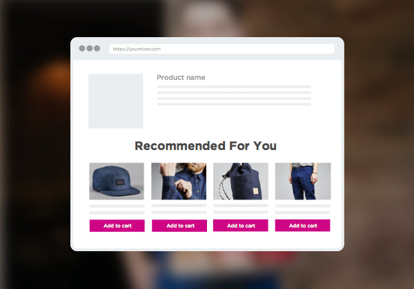
This strategy makes use of your personalization tool by showcasing items that are related or complementary to the product that your customer has already put in their cart. This works just as well for clothing (would you like these pretty sunglasses to go with that blouse?) as it does with equipment (how about an extension cord to go with those Christmas lights?). Offering combinations of compatible products can increase the likelihood a shopper buys both. “Bundling” gives off the impression that the customer is having money because of the combo deal.
These ‘suggestions’ may motivate the customer to buy multiple products, replace with an upgrade, or inspire them to keep browsing altogether.
We love Nosto for this, which offers a gorgeous onsite product recommendations app that integrates seamlessly into your overall website design.

CONDITIONAL DISCOUNTS
Everyone likes to feel like they’re getting a deal, and it’s very easy to provide that experience without sacrificing much of your revenue. The best discounts are the ones that achieve two goals:
- Give the customer a ‘sense of belonging’. By including them in something exclusive they get a VIP sensation
- Impulse them, trigger a fear of missing out, or sense of urgency, which will push them to buy
Limited time offers, bulk discounts that only apply to large purchases, and short term ‘storewide sales’ are the most effective strategies since they accomplish both goals at once.
BEHAVIOR SPECIFIC PRICING
Behavior specific pricing uses behavioral targeting rewards certain actions, such as coming from a specific location like a website, landing page, advertisements or perhaps a reactivation email. Similar to discounts, this change in pricing reinforces that interactions with your brand will be rewarded.
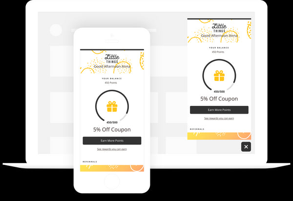
We really love Smile’s customer loyalty program, which creates a great experience while compounding the rewards for repeated purchases. This drives up your average Lifetime Value per customer, which in turn will drive up your total revenue!

CUSTOMER SHOPPING TOOLS
Simplifying the customer checkout process is the very last straw to increasing your conversion rate. It’s surprisingly common for customers to want to buy, get all the way through your purchase portal, only to struggle and give up before completion. To minimize the frequency of this happening, we suggest three key tools: wish lists, comparisons, and purchasing options.
WISH LISTS
There are many situations in which a customer may be browsing your site, but the timing to make a purchase just isn’t right. This is okay, but actions can be taken to encourage the sale later on. Allowing customers to create wish lists gives them the ability to save items they liked for later. This allows them to find items quickly and easily while eliminating the possibility of never being able to find the item again.
Besides improving the organizational habits of consumers, wish lists can also attract new customers to your site. Wish lists can be sent around to friends and families to show them what items you are hoping to receive in the future. Items on wishlists can be purchased from the person who added it to the list or someone else who is buying the item as a gift. Either way, it is a win-win for the merchant and the consumer.
PRODUCT COMPARISONS
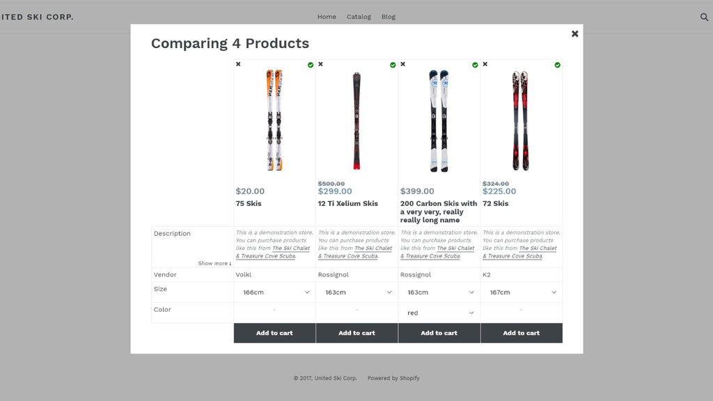
If your product list includes a variety of options or many similar products, your customers may be abandoning their cart because they cannot decide which items they want. Solve this problem by offering comparison tools so that viewers can put multiple products side by side. While this is most beneficial to technical sales, it can be just as helpful for consumer purchases as well.
We recommend Compare It!, which is easy to install and highly customizable.

PURCHASING OPTIONS
If you followed these steps religiously, you are going to bring many more people through your sales funnel right up to the point where they press “Buy” and checkout. Although, that final click is the tallest hurdle. What happens if the checkout total is more than they can afford right now?
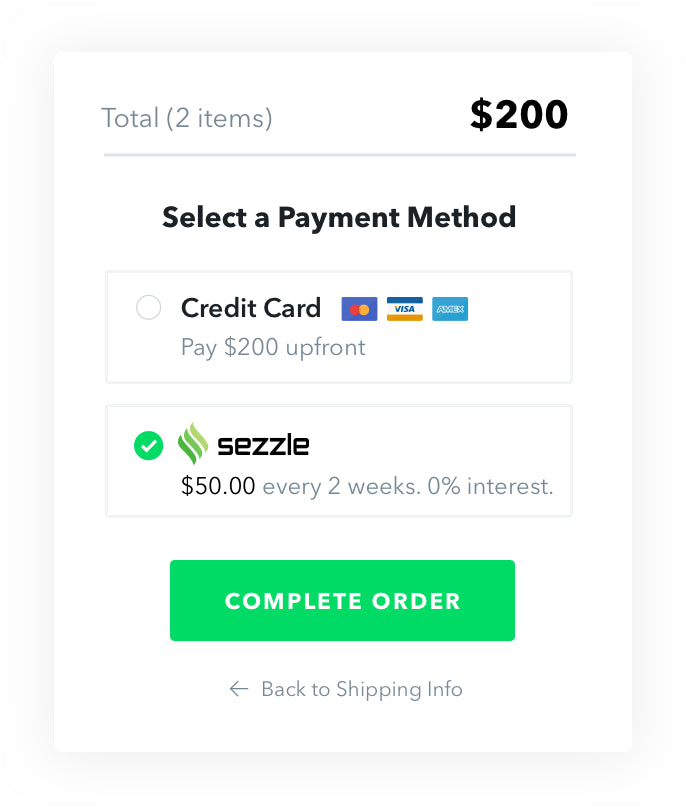
Instead of forcing them to wait to get their stuff while they save up funds or wait for that next paycheck – and likely forget why they were so excited to buy in the first place – offer a variety of purchasing options, from as many credit card and online payment portals as you can, to payment plans.
Sezzle does a great job of this – they offer short term, interest-free loans. Instead of using your customers’ FICO scores, they instead analyze their bank account cash flow to determine risk. There’s a reason why they’ve been spreading like wildfire among online e-commerce retailers!

Conversions Are All About Gaining Trust
In order to successfully increase your conversion rate, you’ll need to realize that really, it’s all about gaining the trust of your viewers. Every piece of your website should appeal to your customers and show that your company is legitimate and takes privacy and safety seriously.
Tune in next week for part-4 when we explain how to make the most of all of these new customers by offering an incredible fulfillment experience!
Leave a Comment


