Web Design Trends for 2016
Nicole Dean
Nicole Dean
The Proliferation of UI Patterns
One of the side effects of responsive design has meant that a lot of sites look similar. However, responsive design isn’t solely to blame. The rise of WordPress sites and the booming theme market also have a hand in it.
But having a similar look isn’t necessarily a bad thing. That’s because we’ve changed the way we consume the web, which has resulted in a lot of common UI design patterns. Design patterns have matured and as such, there’s little in the way of innovation when it comes to UI patterns.
In other words, a checkout will still be a checkout and should function as such. It’s the same with a login model. There’s no real reason to reinvent the wheel. UI patterns must guide users through a smooth experience.

The hamburger menu
While some criticize this pattern’s use, there’s no doubt that it’s widespread use makes the function easily recognizable for users.
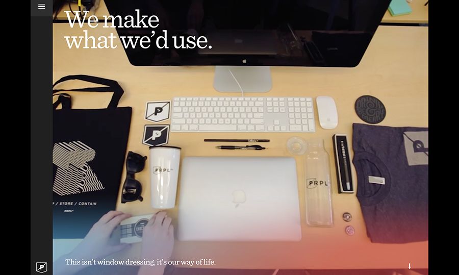
Long scroll
Placing all your important elements above the fold is now a well-known myth. Furthermore, almost everyone is accustomed to long scrolls thanks to mobile devices. The technique works especially well for sites that want to lure users through storytelling, and you can still mimic a multi-page site by breaking the scroll into clear sections.
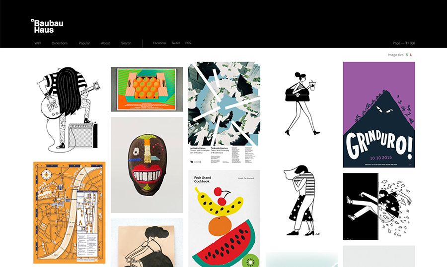
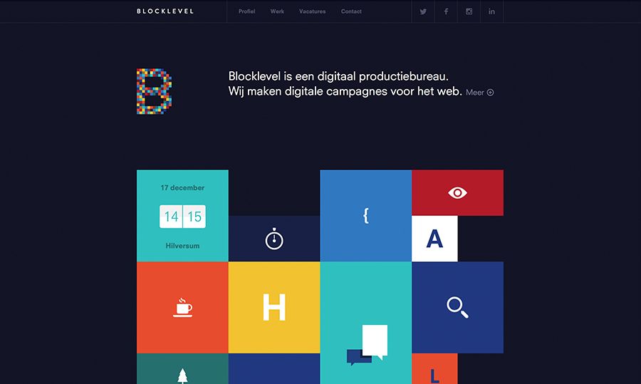
Card Layouts
Pioneered by Pinterest, cards are everywhere on the web because they present information in bite-sized chunks perfect for scanning. Each card represents one unified concept. Since they act as “content containers”, their rectangular shape makes them easier to re-arrange for different device breakpoints.
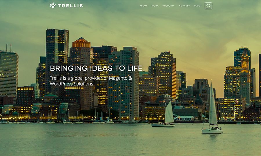
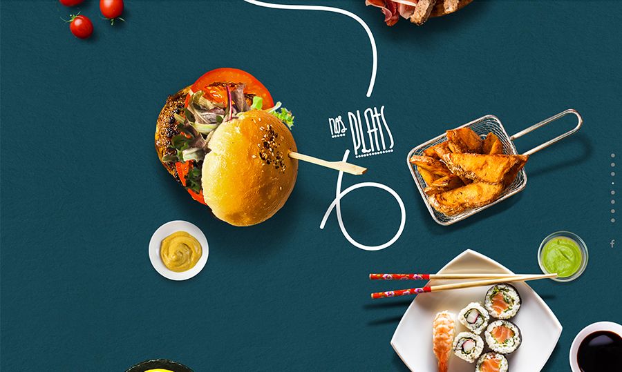
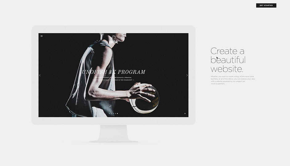
Hero images
Since vision is the strongest human sense, HD hero images are one of the fastest ways to grab a user’s attention. Thanks to advances in bandwidth and data compression, users won’t suffer from slow load times either. One common layout you’ll find is a hero image above the scroll, followed by either zigzagging sections or a cards-based arrangement.
Rich Animations
Animations are being used more and more to enhance a site’s storytelling, making the experience more interactive and entertaining.
However, you can’t just stick animation in anywhere. Consider carefully whether it adds to your site’s story elements and personality. Animations can be thought of in terms of two groups:
Large-scale animations
These are used as a primary interaction tool and they have more impact on users and include effects like parallax scrolling and pop-up notifications.
Small-scale animations
These include spinners, hover tools and loading bars, and don’t require any user input.
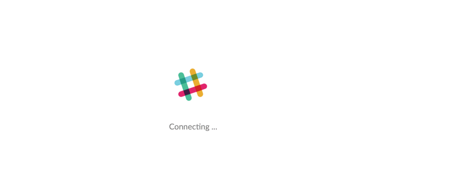
Loading animations
These are used to entertain users and delight users during an otherwise tedious experience. Loading animations tend to be popular for flat design, minimalism, portfolios and one-page sites.

Hover animations
Hover effects give a more intuitive feel to a site as users mouse over content. Users unsure about a feature’s function tend to hover over them automatically for instant visual feedback.
Scrolling
Smooth scrolling relies on animation and gives further control to the user, who can determine the pace of how the animation unfolds.
Motion animation
Our eyes are naturally drawn to motion, which makes it the perfect tool for drawing a user’s attention. Motion can also help with visual hierarchy. This can help to add interest and intrigue to forms, CTAs and menu items.
Background animations/ videos
A simple animated background can add visibility to a site, but should be used in moderation or it can be very distracting to the user. The key is to work on individual sections or create a gentle movement of an entire image.
Flat Isn’t Going Away Anytime Soon
Flat design has been around for a while and is compatible with other trends such as minimalism, responsive web design and Material Design.
Going forward, it’s likely that we’ll see the following further trends in flat design come to the forefront.
- Long shadows. These bring more depth to flat designs.
- Vibrant color schemes. Popular UI frameworks and templates have prompted many to begin using more vibrant colors in their designs.
- Simple typography. Simple typefaces help to ensure that text remains legible and readable in flat design.
- Ghost buttons. These allow for functionality without distracting from the UX and are often represented as outlined, clickable links that change when the user hovers over them.
- Looks to cut down on the number of elements in order to create a fresh, uncluttered UI.
Material Design: A Richer Alternative to Flat Design
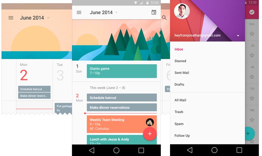
Last year, Google launched its new style language, Material Design. It uses shadow effects and the concepts of movement and depth in order to create designs that appear more realistic to the user.
The goal of Material Design is to create clean, modernistic design that focus on UX. While Google’s design aesthetic has detractors, it’s been mostly praised as a game-changer.
With its minimalistic look, Material Design has a lot in common with another growing trend — flat design.
Material Design, however, makes use of depth and shadow, which allows for more depth than pure flat design.